




Gauntlet's Guide to Galvatron mk2
History of a Madman
Anyone who has a history of viewing this site knows I have a thing for the purple lunatic. And, as all fans with a net connection, I collect pictures of the people I'm fond of. And I have a nice collection of Galvatron pictures.
So, one day I want to draw Galvatron. And I take a really close look at some pictures I use for reference and notice ... some things are different. Sometimes VERY different. And I can't help but wonder why that is and how it came to be that way.
So I comb through the pictures on my HD and begin to see patterns emerging. It's like a puzzle. Each picture brings us closer to what those designers were thinking and that shit fascinates me (Megaman Mysteries, anyone?). This started as a comparison of all the G1 Galvatron toys. Then I figured I'd add in the various pictures to get a really complete picture and this is the result. A step-by-step process of Galvatron's evolution! Behold the geekyness! More than anyone really wanted to know about one of the more unpopular Decepticon leaders!
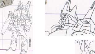
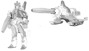
1) Floro Dery's original character sketch. Dery created all the original sketches for the movie characters based on a short synopsis given to him by Marvel. He created them to be transformable, but not to be toys. He never received much feedback from hasbro. The toys are a result of trying to approximate his sketches. Colors were not chosen by Dery, so that accounts for Galvatron's fluctuating color scheme.
Turnarounds and simplified designs were someone else's job. So many people had their hands in the pot so to speak.
So, this is where the everything sort of diverged for Galvatron. If you look here you'll notice that Galvatron's helmst is almost exactly like his toy's (although the back seems to slide downwards. The helmet would later be curved and then curved some more. The sides of Galvatron's helmet seem to flair out ala Darth Vader. You'll note the "hole" on Galvatron's upper chest ... that'll have the red sticker on the toy. Another, subtle thing, is that Galvatron's upper body isn't wide like it is in the final design. It's more like a square - like the toy. Also note the shoulder pads: they aren't attached to the main body as in the final design. They are attached at the shoulders like the toy.
Another things I missed for quite a while is that .... Galvatron has a tail! Right there, on the back of his legs - is a tail! Okay, this is actually the handle on his cannon mode. The part that's visible above Galvatron's head is the "Y" piece on the toy.
Addly the kneepad is upside-down on the toy, based on this design.
Also note that the mount connects directly to the berrel of the cannon itself and NOT the piece at the end. This is rather counter-intuitive. but there you have it.
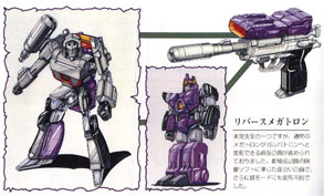
2) Unused art for a toy concept of Megatron Turning into Galvatron. Looks like Meg's legs become Galvy's arms. From the Headmasters Laserdisk. I think.
Galvatron's crown looks like it was based off the above character design. You'll notice that Galvatron looks nothing like he does in any incarnation, though. So it as, maybe, made off a concept sketch of what the Galvatron toy MIGHT look like and NOT the toy itself (as the Megatron mode looks much more like his toy than his animation model).
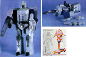
3) The earliest Galvatron toy Prototype that I have. Note: Miscolored cannon. All black belt. Purple hands. Light purple shoulder pads and cannon holder. He doesn't look like he has eyes yet, but that could be shadow. Upon closer inspection it looks like the cannon holder has only the top part at this point and not the huge bottom half. You can see the thing separately beside his canon mode (it looks like something's up with it as I can't account for that piece sticking at an odd angle at the bottom, but it's definitely the toy's cannon count). This is why movie Galvatron's cannon is so short in comparison - the movie designs probably began here. Notice Galvatron's gun has some sort of tube attached to it. It looks like it might fit into the cannon. Perhaps they were supposed to combine and fit somewhere on Galvatron when he was in cannon mode, but this is me wildly speculating.
Also note that Galvatron is transformed like the early character design - with his cannon "holder" down in the back. He has his Galva-tail.
I've included a pic of an Arcee prototype here. Judging from the colors, it probably began here ... it looks less developed than other early designs. I'm putting pictures of other characters in here for the sake of making a timeline.
Also, from the same book are early designs for Ultra Magnus (note his colors - they match the "Return of Convoy" game and the Scramble City artwork!) and Arcee (the body, not the head, matches the design that her toy was based on).
If you look really closely it looks like Galvatron's shoulder pads AREN'T connected to the main body yet (as they are in the movie), but are connected to the shoulder ala the toy. It doesn't look like many people got this though, which may be why they connected them to the main body later.
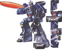
4) Galvatron's toy box pic. Note that the gun no longer has that attachment on it. Also note that the cannon still appears smaller than it does in the final - it's mount matches the prototype's height. Mostly though, it's in this position because the paint job resembles the previous Galvatron. The light gray shoulders, purple hands, and all black belt.
Now, after looking at the earlier prototype and the box art pic, you might wonder how the cannon mount sticks on Galvatron's arm. Well, if you look on the toy it has these weird .... things sticking out on the lower part of his upper arm. On the toy it's nothing, but on the box art there's clearly a hole there . I surmise that the mount was supposed to wrap around Galvy's arm and fit into that peg. This is supported by looking at that original prototype picture - notice the cannon is at the same level as that peg on the other arm. Doesn't look like it would be a very firm connection, which is why, I guess, they changed it.
Also, notice the early sticker designs. Now, box artists do take liberties, but there's clearly a red square on his belt and stickers on his feet. Both of these are likely early designs.
Also notice, Galvatron has red eyes.
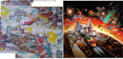
5) Bedding that looks like it's based off an early design for the US back-of-the-box art featuring, prominently, Galvatron and white-chested Ultra Magnus. You'll notice Galvatron is drawn with a red sticker with no Decepticon symbol. This red "sticker" is also present in the box art, even if it's hard to see.
Why they took the Autobot and Decepticon leaders out of their prominent places is a mystery to me. You'd think they'd want the new leaders to be displayed at the forefront.
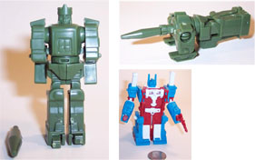
6) Small Kabaya Galvatron was probably designed at this point. Mostly because he's of the same line as Ultra Magnus - and white chested Magnus fits here. This is probably the time Takara sent a bunch of prototypes off to third-party companies to produce related paraphanailia (there's a few white-chested Magnus items lying about the net, if you look).
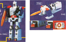
7) Galvatron prototype #2 - The colors are close to the final's. If you compare with the box art and the early prototype you'll notice changes and similarities. Firstly he has red eyes. Maybe he was meant to light up red. His cannon has the mount we have today. Most noticeably - he has different stickers. His belt is different from the box art. Feet are different, simpler. And his chest has an unadorned Decepticon symbol - more like his movie design. Gone are the other stickers featured on the box. Most of the box stickers would return later, so I guess they were experimenting with their look here.
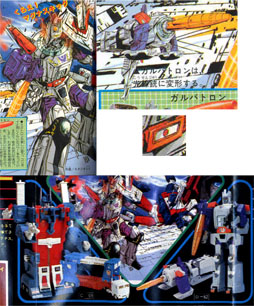
8) The famous scene from TV mag! AND a Scramble City catalogue excerpt. This Galvy was based off the prototype - notice the belt design, the unadorned symbol, and the red eyes. The designer seems to be working off the toy alone and NOT off Dery's character design.
Interesting that Galvatron's depicted only in pistol mode for this article. Also note: no feet stickers. It's also worth noticing that Ultra Magnus' toy design is finalized *here*. Even if his animated model isn't.
At this point the character model began to diverge greatly from the toy / early model. Dery has mentioned that his designs weren't cleaned up by him .... I suspect the TV Mag people had something to do with making Dery's original designs into what we know today.
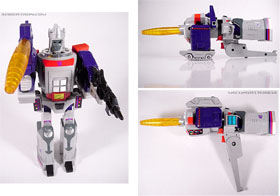
11) Galvatron the toy! In all it's hideousness! Look at all those stickers .... it's likely they brought back the technical crap that the box art used as reference. I'll bet the earlier red sticker didn't have the Decepticon symbol on it though. The yellow sticker was probably just plain red at one point too.
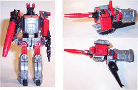
12) The big Kabaya model was based off this version of the toy. Note the stickers. Gives it away as coming after the final toy was designed.

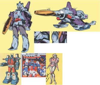
9) A de-saturated Galvatron model cell and Marvel's Transformers Universe character art. This was directly copied from the movie's art. It's here that Galvatron fully diverges from his toy design.
At the time Marvel comics began to make their adaptation for the movie, quite a few characters got new heads. One was Arcee and another was Galvatron. You'll note that although the body is the same the head is different. More movie-like. Also note that the "Galva-tail" is still around.
Galvy's horns have become curved and attached to his head. So now his transformation is totally imposible. It also seems like they firmly decided to make his symbol on his stomach as opposed to his chest ala the toy. His helmet still flares out, but less so than in the original design. It also looks like it's different in the back. Which about summs up the head differences.
At this point it looks like the cannon mount animation-model wasn't changed even though it was changed for the toy.
The Marvel art shows that, at this point, the character design still has the color scheme from the toy, complete with yellow eyes. However, it's not the final toy color scheme. His cannon is orange. His eyes are yellow. But his arms are all purple and, like the prototype, his hands are a different color. Also the top of his boots are a darker grey while the arrows are colorless.
HOWEVER, it's also possible that Galvatron as simply based off a bas photograph of the toy. Also, one must take into account coloring conventions of the time. For instance: silver was always pained blue, that's why Galvatron up there's blue. Moreover, despite Ultra Magnusand Arcee being correct and consistant other characters like Blaster and Springer, from the same series, were not. So, although tGalvatron's color scheme here might be accurate in some ways it is not nessasarily a millestone in Galvatron's color development. In fact, simply because the cannon mode has red on the "shoulder pads" part, and the fact that it has yellow eyes it may simply be the toy's color scheme mixed with the box art botched up a bit.
Notice: A Decepticon symbol on those hip-things in cannon mode. The character's shoulder pads are NOT attached to the main body as they will later be. The kneepads still seem to be upside-down. The cannon mount is small, unlike the toy's. All these are from the earlier model which was not updated alongside the toy.
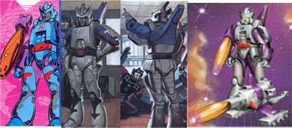
10) A Galvatron from Target: 200 .... whatever that last number was and one from a little kid book at the time and the cover to the Rebirth stories (which obviously used outdated art). This is to illustrate more of Hasbro/Takara's designs circulating and that people were basing colors off the box or toy itself and that means the colors were subject to change. Although the final image MUST have been based off Marvel's character art.
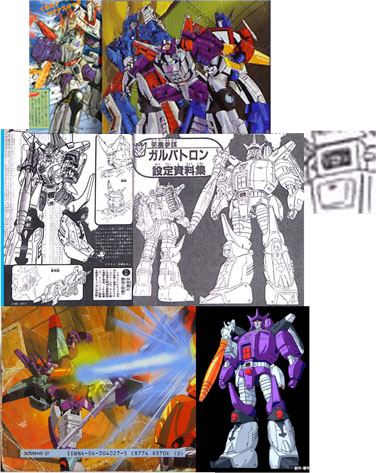
13) Back to the TV magazine Galvatrons. This is where the animation model beganb to diverge greatly, so now we'll follow how that model progressed.
This was shown before the movie came out in Japan's TV magazine as a preview. Perhaps The-Powers-That-Be wanted art to reflect the toy design more. Perhaps they wanted paraphernalia to be different for some reason. I can only speculate on the reason, but TPTB decided to change Dery's model at this point.
This happened after the Scramble City Magazine images. If these models existed then they would have used them, just as they did for every other bit of Japanese-exclusive Galvatron art of this time. So they happened afterwards. HOWEVER: you will note the one holdover from the toy that dates this picture to Scramble City's prototype: his belt buckle! Like those early stickers, these designs have a small circle in the belt buckle. Small indicator? Yes. But there's no other way they would have thought to do that. Of course the toy pototype is shown on the Scramble City toy catalogue ....
Dery's models also didn't come with any colors - that was for TPTB to decide!
As seen we get a hybrid of what will be the final's design and a coloring based very much off the toy (for the curious, the fact that Galvatron was an upgraded Megatron was kept under-wraps and in Scramble City [which was the commission for the first two images] Megatron actually calls Galvatron for help to deal with Ultra Magnus! Of course this was in Scramble City 2 where it was all done with toys and stop-motion animation). The second picture showing a toy-colored Galvatron (with a purple crown) was shown in two other pictures, so the idea might have been favored at some point.
Lastly, we get one REALLY ODDLY colored picture of Galvatron in the mix! He's blasting at Hot Rod, so it's a movie commission and not a Scramble ity commission. I read some specilation saying it's an early character design .... but it really isn't. You can tell it's not from earlier because of the cannon mount - it's large like the finished toy, not unnoticeable like the first prototype. Also note the gun: it's like the final version and not like the first prototype. So they were looking at the final toy design when making all these images. That means the bulk of the characetr design work is done. It's more like a mid-level character design.
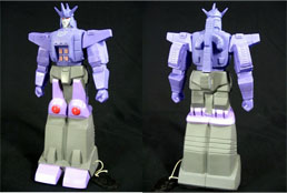
14) Post movie stuff. That TV magazine picture affected just about every bit of Japanese-only merchandise at the time. Which lays credence that it was an actual design and not just artistic license. This is a toy that went unproduced for a long time and then was a special at a Botcon. But it was designed at this time and shows how the design evolved.
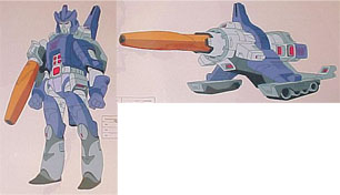
15) Annnnd ... we're back to Dery's design! Now, I'm not sure why they went back, but they did. Maybe the TV Mag stuff was only used to make the character look cooler for Japan and that TBTB weren't very concerned with the likeness (which would certainly make sense).
This model was used often enough later on. The colors look like they were based off TV Mag's colors, or maybe they were developed around the same time. Who knows? But TV Mag shows a development of colors into something we're familiar with today, so that makes me thing that it's responsible for the final colors of Galvatron.
A thing to note is that although the robot's colors were changed drastically, the cannon's were left the same. Well, it *was* the 80's. These things happened back then.
This was the design used for the TF movie poster. Arcee and Cyclonus also use designs of this period in the character development stage.
That odd neon purple waist is wierd to look at though.
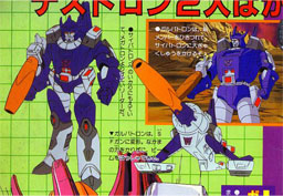
16) The final movie design for Galvatron. He's bigger and meaner. Cannon is colored WAY differently ... it looks like there was *some* attempt to make it seem like G could transform into this (adding in that Decepticon symbol and the red decals), but the redesigned the character model without looking at the cannon mode much or the toy, that's for certain.
I wonder if the red on Galvatron's belt buckle was a sticker at one point. It was in the box art and here it is, in the final. The ovals on his boots retained their shape until now. G has fancier feet. Galvatron's cannon is mounted by magic now .... well, that's okay I guess.
Galvatron is noticably bulkier. Now his body shape is more rectangular than square (like that toy's). His shoulder pads rest beside his head. His head also seems to be streamiled and made more pointy. Abviously the bright purple waist has been changed.
Looks like someone decided to update that cannon design too! it actually doesn't look all that different. Although someone thought it'd be a good idea to make the red square into a Decepticon symbol. I guess the colorist didn't know what to make of the cannon because it still carries over the toy's color scheme. Except he seemed to recognise that the head became the cannon-berrel holder in cannon mode and that Galvatron'd shoulder pads needed to be recolored.
So, this is what happens when the right hand doesn't know what the left is doing. You get a cool design that doesn't really work.
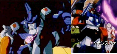
17) Early movie preview Galvatron! You'll see that the Matrix is VERY unfinished and that Diaclone Ultra Magnus makes his famous debut DESPITE them having his final design on-hand! Kup also looks vastly different. At least Arcee is on-model. I speculate that the animators were using an early model sheet someone had and NOT the final for reference (as the models, if you recall, are drawn in black-and-white). In addition to this, Unicron was shon in his final body design but with a different sort of head (which, oddly, made it into the final movie) and Hot Rod was shown in an earlier design where his Autobot symbol was shown on his collar and not in the center of his chest. I .... guess .... these might be animation tests which were strung together for the advertisement.
.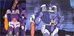
18) The TV show's Galvatron. It uses the movie's design, but the colors of the earlier version of Galvatron. (Look at those knees - they're from the final movie version of Galvatron, but the coloring ont he entire pic is from the earlier model sheet). Similar problems persist for Unicron and most notably for Cyclonus.
Later shows would use the correct model for Galvatron.
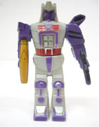
19) Galvatron Jr, for the Headmasters line. Shitty, ain't he? Based off the final toy.
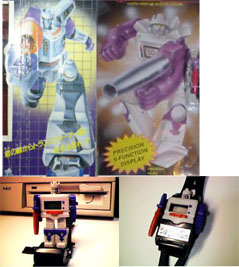
20) Watch-Galvatron made during Generation 2. The Japanese got great box art based off the toy and the first box art while we get some .... monstrosity.
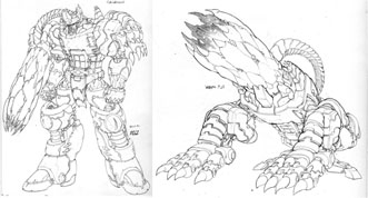
21) Don Figura's unused design for a Cobra-La created Galvatron. Put in for sheer style factor.
22) Early mock-up of reissue Galvatron.

23) Reissue Galvatron. He's purple. He comes with a Matrix. AND he's says different things in Japanese. AND he has a remolded face! More movie-accurate than the original, but he can never be perfect. The legs from the animation model alone are untransformable. ANd this purple is way woo bright. To make it most like the animation model they should have redesigned the cannon mount. Head's too different as well ... although I guess that can't be fixed without massive retooling.
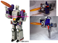
24) And we come full circle with ehobby's gray Galvatron redeco of the reissue Galvatron.
He's based off "Galvatron 2" from one of Marvel Comic's last TF stories. He has a green Matrix (because the Marvel Comics Matrix was green - based off an early design). Ironically, while he doesn't sport the prototype stickers, they made specialty gold stickers to bring him closer to TV Mag's Galvatron. While giving him his released set. Crazy.
But, though the timeline, there's only been 3 main version of Galvatron with relatively minor differences in color and style between them.
1) The toy. It directly influences a few pieces of merchandise and it's color would influence Marvel's run of the Transformers. While most disregard it the fact is if you want to make a transformable Galvatron, you're looking at the toy. Those who want to draw a transformable Galvatron are probably looking at the toy.
2) TV Magazine's Galvatron. The direct influence of this design is limited to Japanese exclusive items made mainly to promote the movie. After it was done, this design wasn't used much. However, it looks like it did debut the final color scheme associated with Galvatron.
3) The Movie's Galvatron. Based off Dery's design, but bulkier and more menacing. Not different enough from it to be called an entirely different design though. This is what people mostly refer to when drawing Galvatron or paying a homage to Galvatron. The colors associated with this design would go on to influence just about everybody who wants to draw Galvatron from here forward. It even influenced the reissue of the Galvatron toy.
And that brings us all through the crazy life of Galvatron.
References:
Seibertron.com
TF Cyber Bon
TF Museum
Botch's TF Box Art Archive
Hatch_1's blog
Cosmic Rust
Super Toy Archive
Prime Saber's Homepage
The Art of Floro Dery
The Obscure Transformers Website