





Captain N: The Game Master
Most who enjoy Captain N actually grew up with it. Those who didn't tend to have been older kids or people encountering it for the first time now. Allow me to put the show into context. It was the 80's and Nintendo was king. But so was the turtles and television. He-man had opened the world to a whole new era of advertisements and it was time for Nintendo to cash in. And how better than to make it's own TV show?
Naturally the characters didn't look anything like the games they were trying to sell ... but they weren't unique in that regard back then. Let's examine similar criminals of the time.
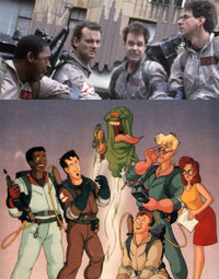
My first encounter with this phenomenon would be with the Ghostbusters. They caused me a lot of confusion as a child. I mean ... just look at them. They look nothing like the movie (which I think I saw after the show, actually). I had no explanation. The only one I got was the they wanted to do something else for the show. Pretty astute for a kindergardener, I think. The reality is that the Ghostbusters had the very real problem of royalty rights if they used the likenesses of the actors who played the Ghostbusters in the movie. They had to make them look different. Naturally, I had no way to know this at the time. The show was actually very different from the movie and I just had to shrug my shoulders. What could I do?
It turns out that they actually *had* planned on using gray suits and an evil Slimer (which accounts for why they had an evil green ghost toy and a good Slimer character). I guess they went in a different direction for those ideas, but I still was unsatisfied that I had an evil Slimer toy while he was good on the show.
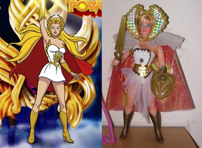
My sister loved She-ra and so I was exposed to how vastly different the toys were to the TV show. I mean ... just look at them. And this is shameful because Mattell brought us He-Man; the very first half hour toy commercial. You'd think those guys would get this stuff right. He-Man was accurate enough, but She-ra? She-Ra herself was probably the best of the bunch, but Catra the toy was nothing like her TV show counterpart.
What's really odd, though, is the story. For the TV show it's revealed that He-Man had a twin sister and she lived on another world - Etheria. So there was a bit of a crossover which led to She-ra's series. Here she was a rebel who fought against the evil forces of Hordak (much like He-man fought against Skeletor). I suppose they wanted to turn any girl fans who liked He-Man on to She-ra. Despite it's 80's-ness, She-ra was a pretty strong woman who used a mighty sword to fight her own battles.
But, what is her story on the back of the toy packages?
She-ra and her friends all live together in harmony except when they're pestered by the jealous Catra who is always trying to spoil She-ra's fun by playing mean tricks.
All right, so TV's She-ra is a strong woman who fights evil and toy She-ra is just sorta pretty and is harassed by Catra. It's a totally different story! Seriously, it is.
I actually found something a few years back that answered some questions about her look. So ... what the Hell? Catra looks like a definite cross between her TV look and her toy look. And it looks like She-ra's hero look (on the show) was her regular "Princess Adora" form (in the comercial). After seeing this, I think I can see what happened.
She-ra was likely planned with a pretty superficial story to complement it's toy line. I mean, in that early ad and on her toy her sword, her most important weapon, looks nothing like the show. It was likely inspired by He-man, but I think the more direct link was added later on. Catra, her main adversary, also looks drastically different in the show than on her toy ... even the logo is different! The change in story influenced Catra's and the sword's design and, likely, a few other concepts as the initial toy and TV concepts diverged.
This early commercial uses a very basic mockup for the book's cover - lacking even that early logo. The sword and Catra's design both resemble the toys as well ... this animation model likely came first as there was no mention of toys (the greater product) anywhere. The toys and character models likely started out identical (with the toys likely beginning production as the books were started), but either the toy was changed or the character model or both. Most probably the character models, however, since Catra and She-ra both retain their old looks and were not updated to follow He-Man and the Horde respectively.
At some point it was decided to make her show directly linked to He-man's. This nessessitated the change in her sword and the need for the Adora character model (it's odd that they didn't use the "armored" version, as it hides her identity better). Now that Catra was placed in the Horde her character model also required a change. The use of the Horde as villains was likely to advertise the toyline (meaning the toys came first and were adapted into the show).
She-ra's story is a lot like Galvatron's.
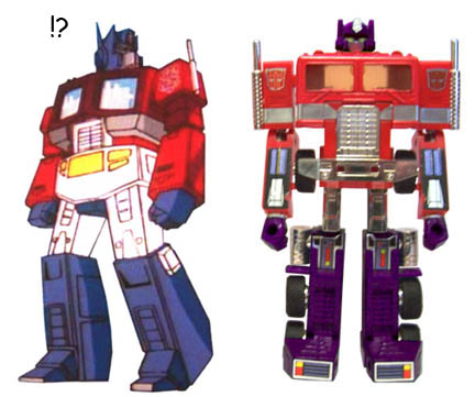
The Transformers have a long and sorted history. Even toys based off animation models end up looking totally different, but the original line of G1 toys had the deck stacked against them before they even hit the airwaves. Try to follow the history:
- Takara has some pretty successful transforming toy lines. They decide to put all their eggs in one basket and acquire molds from other toy companies in order to produce a new line of products.
- These toys have their own box art, which abstracts some from the toys.
- Now, the story is shipped to Marvel comics and the designs are simplified after the box art that will be used off the toy's packaging.
- The art is then refined even further. (anyone remember white Soundwave or black-helmeted Megatron?)
- And it's all based off toys that, by their nature, have misproportioned arms, legs, and that are, essentially, bricks.
Even to this day Transformers suffer from inaccurate character models, but it was the worst in G1, I think. Size was inconsistent. Faces were on character models when they weren't on toys. It was just a weird mix-up. Optimus up there? He got off light. He's actually acceptably accurate by the standards of the day.
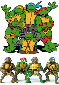
In my opinion the Teenage Mutant Ninja Turtles were the worst offenders of the 80s when it came to brand consistancy. As an adult I can sorta see where they were coming from. Even with the bandannas the turtles were too similar in terms of color. But why didn't that translate to the show? Not enough time? All right, fair enough, but that shit does not excuse the Shredder. Or Krang's android body. Or General Tragg (whose toys were either made more complex or whose character models were made less complex). And they still can't get the consistency thing right.
Not that those weren't good figures in their own right. I liked the turtles figures. Even the "gross-out" factor they inexplicably put in. As an adult, I know that the figures were made with the original comic's style in mind. However, I didn't know that as a kid. All I knew was that the regular Shredder toy sucked and that the one with the spinning arm was better. Until I lost part of his armor, then he sucked too.
Slash was similar to Captain N. His cartoon model looked nothing like the toy (which came first) and it left me wondering why.
And you know what? This is not the end of the list. Video games of the time always had slightly better looking heroes on their box art. Super Mario mixed the Japanese Mario 2 art with the original's art in their promotions, which worked well enough, but there were unexplained oddities like evil Mushrooms, flying Bloopers, and red piranha plants that had me scratching my head for years. Years later they would mangle the Power Rangers toys and give the Pink and Yellow Rangers the same body mold as the boys on the team. I was especially disappointed in the lack of new paint on the Green Ranger toy. They just made him a regular ranger with a shield. He didn't even have the Dragon Dagger or a black holster to carry it in, which kind of disappointed me at the time since the Dragonzord itself was so phenomenal (inaccurate stickers and all).
This was the world, my friends. This was the time of ... Captain N. Nothing looked like anything else, so Captain N really didn't stand out in this way.
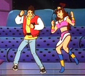
Now that we're on the subject of Captain N, let's get to talking about him. Captain N's basically a cool kid-safe 80's teen named Kevin. Who loved Nintendo. Of course I dunno how many jocks loved to play 8-bit NES at the time. Then again he is the game master (long before Yougi was), so there you have it. There really isn't much to Captain N, but once he's in Video Land he never once mentions missing his parents, friends, or anything else about his old life. So maybe he's more like hardcore nerds than I figure, eh?
The deepest Kevin gets is that he'll forget everything about Video Land once he leaves, so he's hesitant to leave all the friends he's made behind. Of course this point is brought up only once and in one episode he actually does leave (but not really) and this plot point was never mentioned.
 Kevin uses the Zapper and Power Pad as weapons. People often comment on the lack of the Power Glove - a major accessory at the time - but those people forgot about the Ultimate Warp Zone. Yeah, that's right - it's the Power Glove.
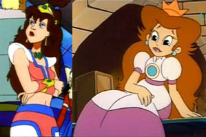
And then there's Princess Lana, Kevin's main squeeze. Despite being Princess of Video Land, Lana herself is not from any video game. There's some who came up with a very obscure reference for Lana which might possibly be true, but me ... even when I was a kid I have always thought she was just supposed to be Princess Toadstool. Consider this:
- They are both princesses unable to help themselves.
- They both have wild brown hair (Toadstool's hair was brown in the cartoons produced by the same studio).
- They're both pretty in pink.
- They're both princesses of Nintendo products. One's the princess in Nintendo's flagship franchise. The other is princess of all of Video Land. Lana's not a queen. Or an Empress. She's a princess. As an original character she could have been anything, but the producers chose princess.
Now ... there isn't any proof that Lana is a Princess Toadstool copy or anything. But come on, guys.
Another thing that bugs me about Lana is that she's shown herself to be pretty capable with Cap N's zapper. And yet, she carries no weapons at all. None. So, when she goes on missions, she has to borrow Cap N's Zapper. She makes herself a total liability. There has to have been some other Nintendo product that she could have used to make herself useful. Or, even if they gave her that staff she's shown with in the comics and some of the concept art.
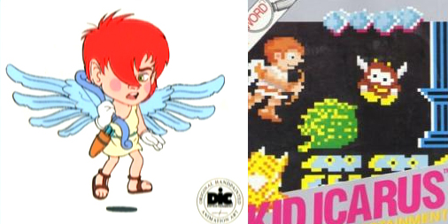
Now we come to Kid Icarus. In the games he was called Pit. In the show it was Kid Icarus. Personally, I never got why he wasn't called "Kid Icarus" in his own game. Obviously he's a reference to the myth of Icarus, who made his wings of wax. Why Pit? On this one, I think Captain N got it right.
So, Pit actually looks a lot like he does in the games. Bow? Check. Sandals? Check. Toga? Check.
There isn't very many ways you can go wrong with a guy like Kid Icarus. Everything else is due to art style. I guess they did change the color of his hair, but ... so what? All they had to go on was the crappy sprite in the game and on the box.
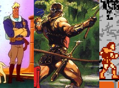
Simon is, quite possibly, the greatest deviation in the main character cast and is quite infamous for it. More so even than Megaman (whom I'm getting to). Looking back, I kinda think he's meant to be sort of an Indiana Jones type (it was the 80's, remember). He's a foppish, narcissistic idiot, but he does have some skills despite all that. Nothing like the Simon of the games at all. Not only that, but he looks like an old pilot more than a vampire hunter. All the game shows is Simon's back, so maybe they felt they had more freedom in terms of his design. I really don't think Konami gave them any reference materials, so they probably had no clue what he was supposed to be. But there *are* some visual similarities.
- The game's box art shows Simon with a headband. This would translate into the goggles we see.
- The box art has a dagger at his side and the sprite does as well ... this became a whip in Captain N.
- Both versions have a belt.
- Both versions have long boots. They're better seen on the sprite.
- Simon's gauntlets, seen a certain way, can be interpreted as the same gloves he wears in Cap N.
- The sprite has, what can be interpreted as, the fur around Simon's coat collar.
- Box - Simon's bulging calf muscle can be interpreted as the buldge on Cap N's Simon's aviator pants.
- Simon's jacket sticking out of his belt can be seen on his sprite. If you compare the sprite to Cap N's Simon Belmont the changes don't seem so bad.
- Box art Simon looks like he might be blonde thanks to the highlights. Furthermore, sprite-Simon has short hair.
All in all, though, Simon got a pretty drastic change.
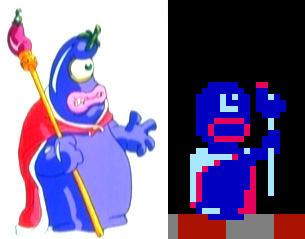
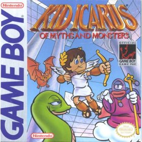
Eggplant Wizard is a guy who proves the Cap N guys actually played the games they based the show off of. Or at least they played Kid Icarus. I suppose there isn't very many ways the Eggplant Wizard can be interpreted, and I can't find any official art of him either. Except on the cover of Kid's Gameboy game, which came out after Cap N. They weren't far off at all, if you ask me.
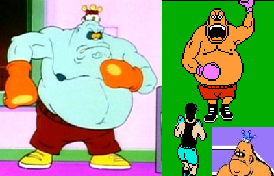
King Hippo is another guy who was pretty close to the games. Except it looks like he drowned at some point. Probably to make him look more hippo-like. I mean, a fat guy challenging Cap N is ludicrous ... but a fat blue guy challenging Cap N is .... still ludicrous, but more in line with the rest of the show.
The only thing that ever bugged me is that he came from the "world" of Punch-Out. Which is just one building with boxers training away. Some freakin' world, man.
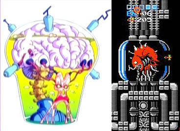
And now we have Mother Brain. Well .... she's in a jar. And she's a brain. And she has metal stuff sticking out of the top. But she isn't much like the real Mother Brain at all. The animators also gave her tentacles so that she could move things around. Maybe the silhouette of the brain could be considered similar ... and the stretched bits of her face could be seen as corresponding to those wires on the NES version ... but, no. She's very, very different.
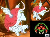 Oh, and by the way ... there are Metroids in Captain N! I've seen a lot of talk about how there isn't. And I don't blame people for not being able to see them for what they are. But here it is, this is Captain N's Metroid.
But now it's time to examine one franchise more closely. That's right ... I'm talking about Megaman.
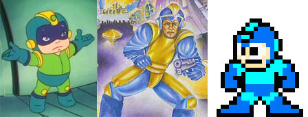
Oh, you are looking at it right. I lay the blame for Captain N's Megaman squarely on the shoulders of the US MM1 box art! Just look at the similarities.
- Single yellow "mohawk" on the helmet.
- Use of a visor.
- Yellow "ear things" on the sides of the helmet. Use of yellow on the knees. Use of yellow to separate the arms from the body.
It seems to me that there was an attempt to marry the US box art with the sprite for Cap N's Megaman with no knowledge of how he's actually supposed to look. But, then, how the Hell can they know how he's supposed to look? The manual doesn't give you a clue. As to why he's green ... I dunno. Mandi (of the Megaman Homepage) suggests that their TV's color settings were off (a common problem for the TVs of that era .... they really did suck). That seems like a plausible explanation. Maybe they had a really crappy box, which made MM look green instead of blue? This I cannot say. Sometimes the show would color him blue, so the color is best considered to be a true mistake.

Capcom has nobody but themselves to blame for Mega Girl and Dr. Wright. Yeah, I called him Dr. Wright, the same name found in the MM1 instruction manual.
Dr Wright, for example, looks pretty much as he does in the MM1 manual. His proportions are dead-on. And his sprite? To the uninitiated, I suppose that line under his eyes could be mistaken for a large nose, just as Megaman's eyes could be mistaken for goggles. I'm not making this up, guys .... just look at the result! I suppose I could find fault with them making his lab coat green, but ... he'd have a pretty blank color palette without that. Even his shaved head could be a misinterpretation from MM1's manual art. See how the shadow cuts off his hair?
And Roll? Not even named in MM1. Not in the manual, not in the game. We wouldn't know her deal until MM3. The name Rock wouldn't be known until MM4. So how was anyone to know she wasn't a "Mega Girl"? Sure she looks totally different ... but she has blond hair and wears pink. The rest is to make her "mega".

At this point I think it's obvious that I'm working under the assumption that the Cap N people were given no guides for how the characters were supposed to look, but that they tried their best with the materials at hand. I think that it's obvious that they're working from referencing the games themselves or art from the manuals and box art. Case in point: Rush.
Rush actually looked a lot like the games, if I remember my reaction as a child well. He has "wheels" to connect his legs to his body. He had a triangle on his head, but if you look at the box art and the sprite it's easy to see where this error came from. The eyes are obviously an attempt to fit Rush's large eyes into Cap N's style. It really looks like they used the game's sprite as a reference as opposed to any other art,because his entire rear end is a rocket and his entire midsection is dark red. You might make this mistake if you only looked at one Rush sprite.
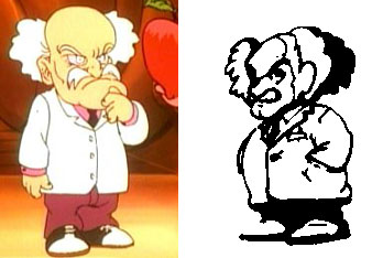
Wiley ... not many ways you can get him wrong. As long as he wears a lab coat and looks like Einstein you could say any character's Wily. Moving right along ...
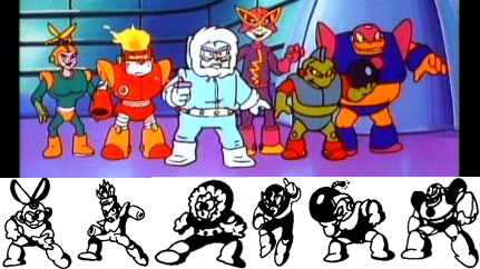
I really think they were working off the manual art for these guys. Look at the line on the side of Bombman's head. It's present on Cap N's Bombman. Now that's supposed to be shadow, but how is anyone supposed to know that? Fireman shows a similar misinterpretation. Those eyes on his head misinterpret the ridges shown in the art. Ice(cube)man's chiseled face also looks like it came right off the "shadow" on the manual art. Elecman's manual art is blurred beyond all recognition and his model is all weird as a result. The mask is a result of the helmet merging with the top part of his body design. It would also explain why the colors are so off. I don't think they actually finished a level. But that's not an excuse since the RMs are all there in full body at the stage select. Fireman's fireball looks like a Tackle Fire ... maybe they thought it was a cute reference?
But even saying that I can't imagine what happened with Cutsman. Maybe it was because he was the only RM with any sort of role in the show and they wanted to make him better for it. Maybe they just couldn't remake him in the style so they decided to just mess him up. No clue. He kinda looks like the manual art if you squint.

At this point I honestly think they stopped caring about getting games right and went with artistic licence. Quick is actually the closest in terms of black-and-white line art and even he's totally off. Things to note:
- Metalman shoots his blades out of his arms. His hands retract and he just starts blasting away.
- Woodman's "Leaf" Shield isn't a leaf and he uses vine attacks.
- Airman's Air(plane)man here. At least he had a fan in his arms. But how is he supposed to catch a football? (in the show the MM2 guys were playing football).
- Heatman's gained a lot of height and lost an arm.
- They took the name "Clashman" much too literally here! He had a hand, so I guess that's because they're playing football. His arm is also like that ball-catcher thing grade schoolers use. I guess they couldn't figure out where those bombs were coming from. Not that I blame them ... the Crash Bombs don't have drills anywhere on them!
- No Flashman.
Also: check out MM2-manual Woodman! That's not the final version of Woody at all. Leaves on his chest and FIRE IN HIS HAND! In the final the Atomic Fire actually weakens him! Makes you wonder what his attacks would have been, eh?
All in all, though, the basic designs looks *something* like the real MM2 guys. With the exception of Bubble man and Airman (and even Bubbleman has one gun arm and a tube on his head). I think this means the designs went through a few versions before being approved. Even more so than the MM1 guys. I think that they realised that they never got it right at this point and just decided to make the show as appealing as possible (remember, this was the 80's, so any "appealing" designs gotta be questionable).
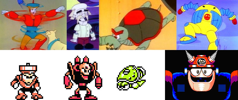
And, finally, MM3. From the Rush example earlier, I think it's safe to say they were looking at the games for their interpretation of the MM3 guys. And, while Skull Castle was dead on, everything else wasn't. I think they only played until Wily level 1 in fact, since that's the only Wily boss we actually see. They did know to use Shadow Blades to beat the Turtle machine, but I think that's more them reading Nintendo Power than anything else. Although they might have gotten to Pinbot since Doc Robot seems to be the android Wily from that level.
Now it's important to note that the MM3 episode was shown on their Season 3 .... which was paired with Super Mario World. Undoubtedly, it's their weakest season and the shows were half the length they used to be. All the designs were simplified in order to save costs.
So, what happened to Topman? I guess they figured he was red, and I guess I can see where they might have thought the black on their TV mighta been blue and ... Hell. He's just different. He bears a passing resemblance to the sprite, but it looks more like they just made him whatever they wanted.
Doc Robot is one of my favorite Captain N abominations, and I think they changed him to suit his name more than anything. In Cap N all he ever uses is metal blades, but these guys aren't stupid. They had to have fought more than one Doc Robot. Still, there *is* a robotic Wily in the game, so this Doc Robot just might be related to that one.
I don't think they got to Gamma. Topman and the turtles bear a passing resemblance to their game counterparts. The Hard Knuckle and Shadowblades do as well. Doc Robot has a good explanation as to why he's so different. Gamma just has no damn excuse. They probably just heard "peace robot" and designed this monstrosity based on that and that alone. He does look like a hippie.
So there you have it. Captain N. Or at least how it pertains to Megaman. There's a lot more you can say about the design choices made in the series. But then pictures speak a whole lot louder than words, don't they?